Developer: Radoslaw Felich
Publisher: Ultimate Games
Platform: Switch, Android
Tested on: Switch
Blindy – Review
The eShop page for Blindy promises a challenging and hardcore platformer that is “not unfair”. Given that these game descriptions are provided by the developer and not written by Nintendo themselves, it feels odd that Ultimate Games feels the need to defend the fairness of their game. We took a look at the game to see whether Blindy delivers what it promises.
Story
There is no story to Blindy. You play as a blind character, assumedly the titular Blindy, though this is never stated in the game. Blindy needs to navigate through a gauntlet filled with deadly traps. How did poor Blindy end up in this horrifying situation? That’s a mystery we will never know the answer to.
Graphics
Taking cues from early NES-games, Blindy boasts very simplistic graphics on a mostly black screen. This stylistic choice makes sense given the concept of the game, but in practice, there’s very little that will draw you in visually. Somewhat surprisingly, the game doesn’t go all the way with the retro-graphics when it comes to fading to black. This is done in a more modern, gradual fade rather than the expected retro-ish screen flicker. It’s an odd choice that feels out of place, and it betrays that Blindy is a more modern game than the first impression suggests.
Sound
A single music track accompanies Blindy as he stumbles his way through the death gauntlet. The upbeat music track is quite catchy but doesn’t fit the style of the game. Not only is it far too cheerful, but the music sounds to modern to mesh with the 8-bit style graphics. An actual retro tune would’ve probably felt more suitable.
Gameplay
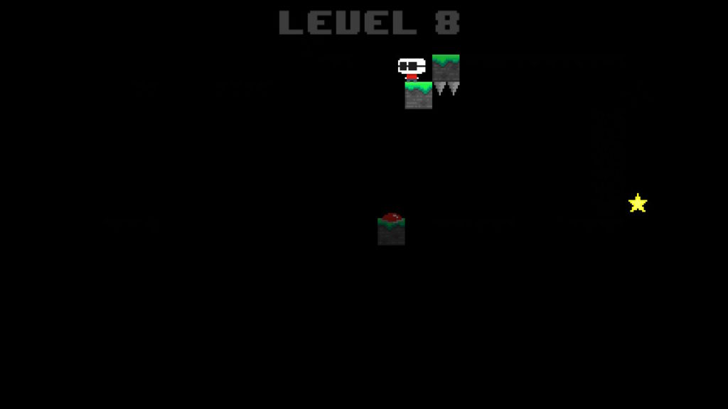
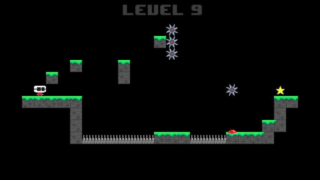
With no story and very simplistic graphics, the bulk of what Blindy has to offer lies in its gameplay. At its core, it’s a simple platformer where you need to guide Blindy from point A to point B and avoid obstacles along the way. The twist here is that Blindy is, well, blind. As a result, most of the screen remains black, except for the spot where our blind protagonist is. This means that you can’t see what’s in front of you until you hit it. Run into one of the many obstacles that litter the levels, and Blindy instantly meets his untimely and bloody demise. Fortunately for our little friend, he will instantly respawn, and the visage of where he died will linger for a few seconds before fading into blackness again. These remnants of a previous attempt will help you in visualizing the layout of a level, which is essential for completing it. Make no mistake: Blindy will die a lot as you stumble through a level and figure out where all the death traps are, and there are a lot of them. This is a game that is brutal not because it was designed to be brutal, but because dying is part of figuring out a level. You’ll have an infinite amount of lives at your disposal and although earlier levels can be cleared in two or three tries, later levels can really rack up the kill count.
It seems like the dev team behind Blindy never really made it past a single idea. It’s simple and short, but it’s also based around a single gimmick that is stretched out way too far. After a few levels, you’ll feel like you’ve seen all the game has to offer. An attempt was made to flesh out everything by adding a 99-lives mode -as opposed to the infinite attempts in the regular game- and leaderboards, but this isn’t enough incentive to revisit Blindy after you’ve spent an hour or so tinkering with it. The point of the leaderboards is rendered obsolete too, simply by how easy it is to cheat in this game. Yes, you read that right: it’s ridiculously easy to cheat your way through Blindy. The game has an ‘Easy’ setting, in which you get to see the layout of the level for a split second before everything goes dark. Combine this with the screen capture function on the Switch and you can see what we’re getting at: if you’re fast enough, you can simply take a snapshot of the stage and refer to it whenever you get stuck. Other software on the Switch shows that it is perfectly possible to disable the screen capture function, even at specific points in a game, so it’s strange that Blindy left this in. At a casual level, it’s not too much of a bother and can be quite helpful, but don’t expect to rank high in the leaderboards if you’re not abusing this loophole. It’s enough to take any semblance of skill -and fun- out of the game.
Conclusion
Blindy is what happens when you have a semi-decent idea for a gimmick and never expand upon it. We’re not quite sure how the concept of a blind platformer could have been improved upon, but what’s present here simply isn’t enough to justify a full game. Design flaws, including the screenshot loophole, and an overall lackluster presentation make for a game that simply isn’t worth your time.
Blindy - Review,


No Comments