Written by: Philippe Geluck
Illustrations: Philippe Geluck
Coloring: Philippe Geluck
Publisher: Blloan
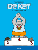
De Kat #3 Op en Top De Kat – Comic Book Review
De Kat (Le Chat) is a figment of cartoonist Philippe Geluck’s mind and used to be published in the Belgian newspaper Le Soir. Soon he became extremely popular and as a result also got published in his very own comic book series. Let’s dive into this new album and see what it is that makes this fat cat so well loved.
In Op en top De Kat, you are treated to many short gags, usually consisting out of three panels. Most of the time you just see The Cat himself, talking directly to you and giving you a different view on ordinary things. Because the idea is so simple it is funny, but at the same time makes you think. Maybe things really are that silly, without us even realizing.
Next to the three paneled gags there are also one panel cartoons to change things up a bit. In these gags it isn’t always The Cat himself who takes the lead, as you will also find random gags. Often political and philosophical questions are being asked or put to the test, but this may not surprise that much, as The Cat used to be published in the newspaper. While this may sound very serious it is absolutely not. The idea is so basic and absurd that the cartoons will at least make you smile.
Every now and then you can also enjoy some one and two page long gags but truth be told, these are a lot less funny than the shorter ones. Philippe Geluck does a better job when making his point with less words. Luckily there aren’t too many of the long gags to be found in this album.
The illustrations are very basic, as they are drawn with thick black lines. Backgrounds are simply not present, but they would also be unnecessary. The background is simply not needed and the bold colors and strong black lines that are used match the text very well. The three paneled gags usually have the same layout, namely simply three times The Cat, with a simple background color. The only things that are always different are the colors of his tie and jacket. This layout may seem very dull but it actually adds greatly to the point that is made in the cartoon.
The Cat is rather chubby and always dressed in a long coat and tie. This, together with his big feet, round eyes and gigantic nose, makes his appearance quite funny, which in turn makes the gags more loveable.
Conclusion
In De Kat #3 Op en Top De Kat there is quite some variation in length as well as the topics of the gags. This helps to keep things fresh and interesting. Overall it’s fair to say that the simplicity in the way the topics are handled, as well as the simplicity of the illustrations, is what makes these gags much more than they really are.
De Kat #3 Op en Top De Kat - Comic Book Review,


No Comments